
Agora internal design
Role: Brand & marketing designer, project lead
In collaboration with: Brand, content & creative team, Operations & HR
Including: Employee branding language, the employee journey
Timeline: 2025-2026
Tools: Figma, Claude, After effects
Agora employee branding
The challenge
A project that kept waiting its turn
Employer branding had been on Agora's list for a long time. The brief, shaped with Operations & HR: create a language that connects people, drives engagement and unites everyone around the company's values - without drifting away from Agora's brand or the real-estate world it comes from.
The solution
Derived, not invented
I built the employer brand from what Agora already owned (its colors, typography and graphic language) and pushed it somewhere warmer and more playful. Architecture illustrations keep the real-estate DNA, while people, stickers and toggle-shaped pills bring in the human side.
Process
I worked with Operations & HR to turn the brief into touchpoints along the employee journey, and with the brand, content & creative team to keep the language true to Agora. From there, I broke Agora’s brand into building blocks and rebalanced each one for an internal audience.
Color palette
Agora’s palette, rebalanced toward deep backgrounds and bright accents: clearly Agora, with a more celebratory energy.
Typography
Agora’s own fonts keep it unmistakably Agora, with Canela bringing a warmer, more personal tone.
The toggle
A pill that carries type, frames photos and stacks into headlines, simple enough for anyone in the company to build with.
Architecture
Modular buildings and arches keep the language rooted in real estate, even when the story is about people.
People
Real employees, cut out and front and center, because colleagues are the best proof of a culture.
Stickers
Stickers that turn the company values into something playful, from decks to new hires’ laptops.
Brandbook
To make the language usable by HR, content and anyone else in the company, I documented it in an internal brand book: values and personality, color, typography, graphic elements, layout and grid, dos and don'ts, and examples.
Agora employee-brand brandbook
Deliverables
The employee journey - from the first email.
01 - Candidate
Every step of the hiring process got a branded touchpoint - from “Thanks for applying” through interview scheduling and home assignments to the offer letter, before and after signing.
02 - Onboarding
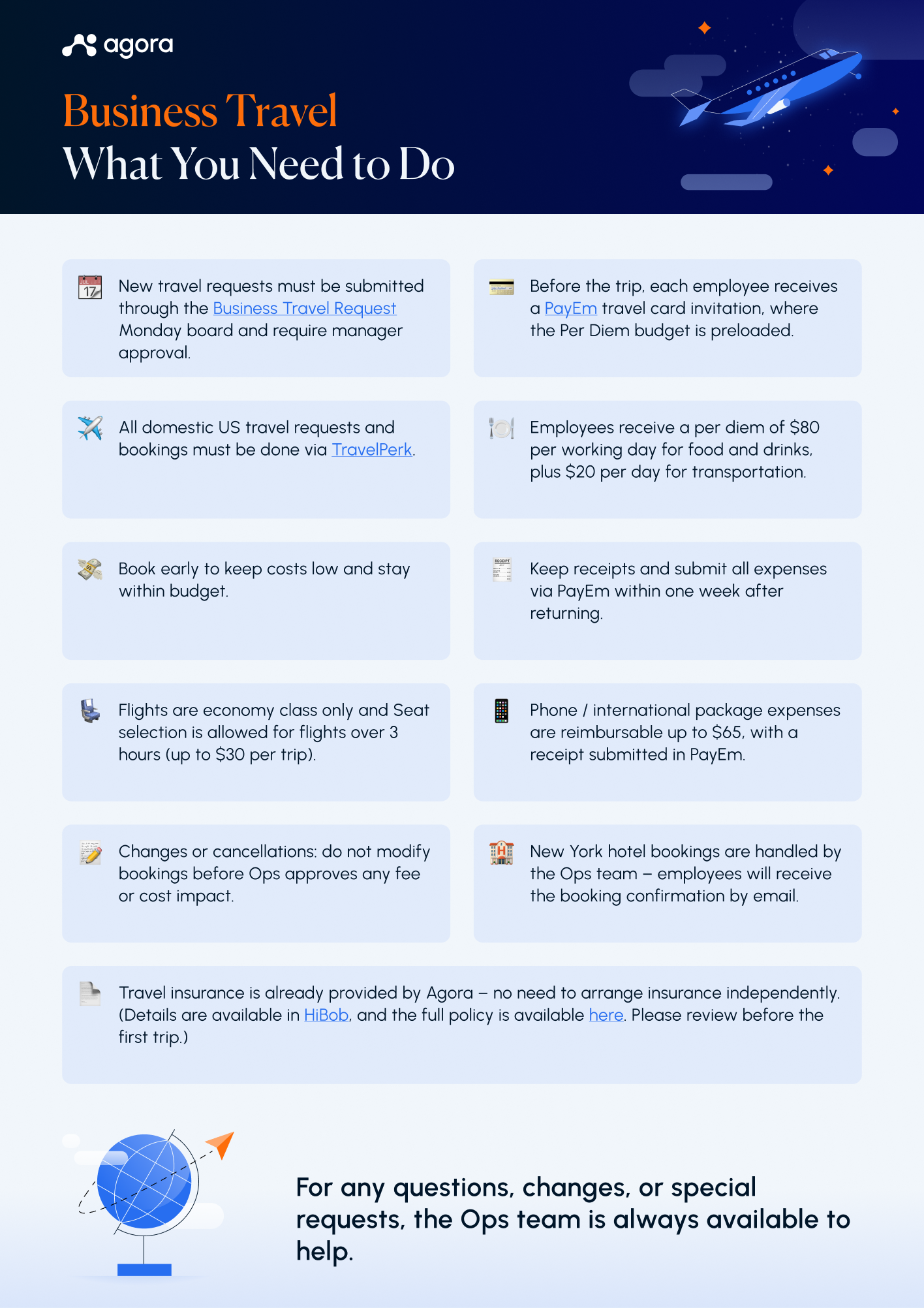
The first weeks: a LinkedIn banner to announce the new job, the welcome deck HR presents on day one, one-pagers that answer the practical questions, and a printed welcome card.
03 - Milestones and day-to-day
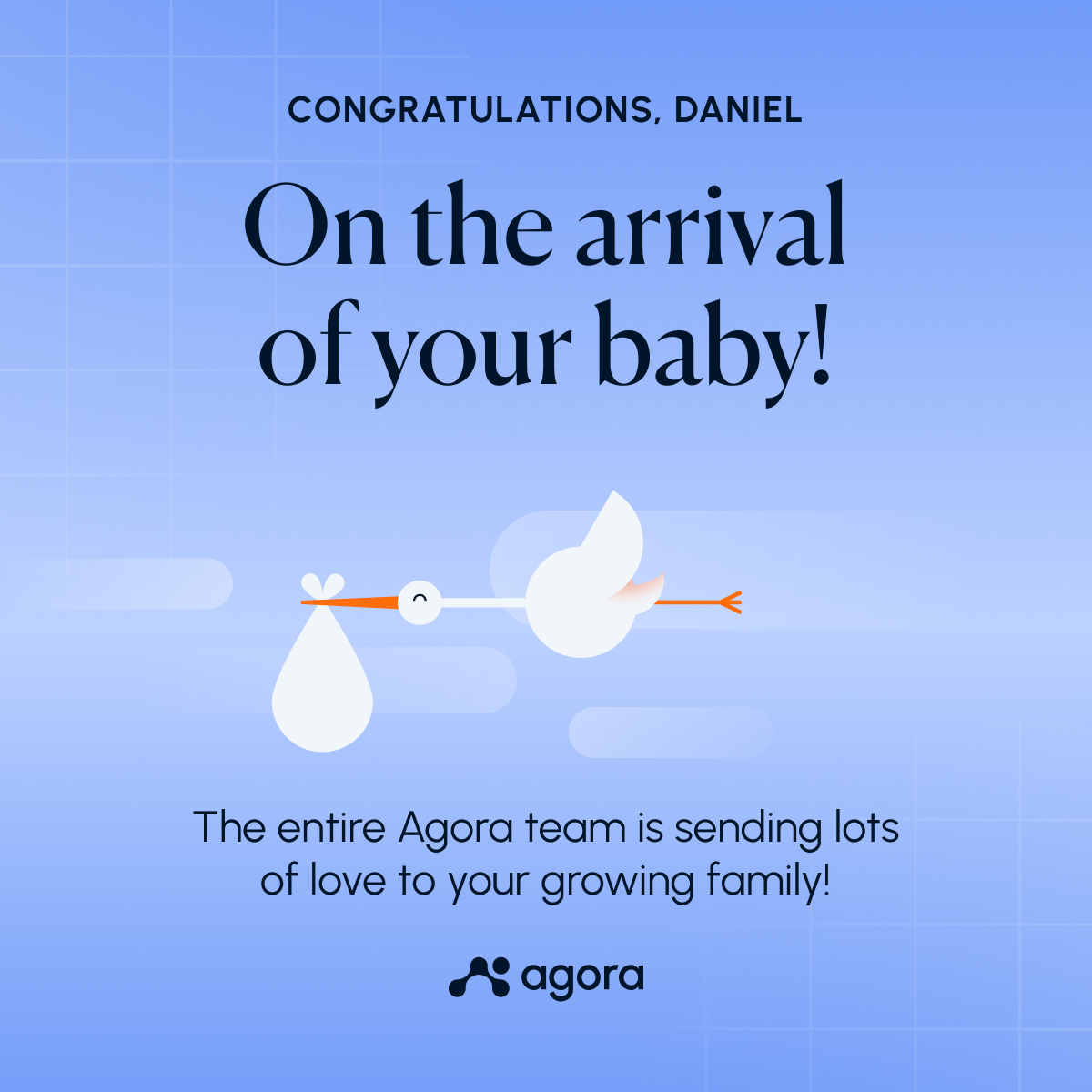
Moments worth celebrating - on LinkedIn for the outside world, on Slack for the team: work anniversaries, promotions, birthdays, weddings and new babies.
04 - Growth
Out of the employer brand came a program of its own: Agora Level Up - an internal mentoring program that pairs mentors and mentees from the company for enrichment sessions. I branded it as a sub-brand of the language, from the teaser to the session invitations, plus a certificate for the company's all-stars.

previous project
next project

Agora internal design
Role: Brand & marketing designer, project lead
In collaboration with: Brand, content & creative team, Operations & HR
Including: Employee branding language, the employee journey
Timeline: 2025-2026
Tools: Figma, Claude, After effects
Agora employee branding
The challenge
A project that kept waiting its turn
Employer branding had been on Agora's list for a long time. The brief, shaped with Operations & HR: create a language that connects people, drives engagement and unites everyone around the company's values - without drifting away from Agora's brand or the real-estate world it comes from.
The solution
Derived, not invented
I built the employer brand from what Agora already owned (its colors, typography and graphic language) and pushed it somewhere warmer and more playful. Architecture illustrations keep the real-estate DNA, while people, stickers and toggle-shaped pills bring in the human side.
Process
I worked with Operations & HR to turn the brief into touchpoints along the employee journey, and with the brand, content & creative team to keep the language true to Agora. From there, I broke Agora’s brand into building blocks and rebalanced each one for an internal audience.
Color palette
Agora’s palette, rebalanced toward deep backgrounds and bright accents: clearly Agora, with a more celebratory energy.
Typography
Agora’s own fonts keep it unmistakably Agora, with Canela bringing a warmer, more personal tone.
The toggle
A pill that carries type, frames photos and stacks into headlines, simple enough for anyone in the company to build with.
Architecture
Modular buildings and arches keep the language rooted in real estate, even when the story is about people.
People
Real employees, cut out and front and center, because colleagues are the best proof of a culture.
Stickers
Stickers that turn the company values into something playful, from decks to new hires’ laptops.
Brandbook
To make the language usable by HR, content and anyone else in the company, I documented it in an internal brand book: values and personality, color, typography, graphic elements, layout and grid, dos and don'ts, and examples.
Agora employee-brand brandbook
Deliverables
The employee journey - from the first email.
01 - Candidate
Every step of the hiring process got a branded touchpoint - from “Thanks for applying” through interview scheduling and home assignments to the offer letter, before and after signing.
02 - Onboarding
The first weeks: a LinkedIn banner to announce the new job, the welcome deck HR presents on day one, one-pagers that answer the practical questions, and a printed welcome card.
03 - Milestones and day-to-day
Moments worth celebrating - on LinkedIn for the outside world, on Slack for the team: work anniversaries, promotions, birthdays, weddings and new babies.
04 - Growth
Out of the employer brand came a program of its own: Agora Level Up - an internal mentoring program that pairs mentors and mentees from the company for enrichment sessions. I branded it as a sub-brand of the language, from the teaser to the session invitations, plus a certificate for the company's all-stars.

previous project
next project
Agora internal design
Role: Brand & marketing designer, project lead
In collaboration with: Brand, content & creative team, Operations & HR
Including: Employee branding language, the employee journey
Timeline: 2025-2026
Tools: Figma, Claude, After effects
Agora employee branding
The challenge
A project that kept waiting its turn
Employer branding had been on Agora's list for a long time. The brief, shaped with Operations & HR: create a language that connects people, drives engagement and unites everyone around the company's values - without drifting away from Agora's brand or the real-estate world it comes from.
The solution
Derived, not invented
I built the employer brand from what Agora already owned (its colors, typography and graphic language) and pushed it somewhere warmer and more playful. Architecture illustrations keep the real-estate DNA, while people, stickers and toggle-shaped pills bring in the human side.
Process
Color palette
Agora’s palette, rebalanced toward deep backgrounds and bright accents: clearly Agora, with a more celebratory energy.
Typography
Agora’s own fonts keep it unmistakably Agora, with Canela bringing a warmer, more personal tone.
The toggle
A pill that carries type, frames photos and stacks into headlines, simple enough for anyone in the company to build with.
Architecture
Modular buildings and arches keep the language rooted in real estate, even when the story is about people.
People
Real employees, cut out and front and center, because colleagues are the best proof of a culture.
Stickers
Stickers that turn the company values into something playful, from decks to new hires’ laptops.
Brandbook
To make the language usable by HR, content and anyone else in the company, I documented it in an internal brand book: values and personality, color, typography, graphic elements, layout and grid, dos and don'ts, and examples.
Agora employee-brand brandbook
Deliverables
The employee journey - from the first email.
01 - Candidate
Every step of the hiring process got a branded touchpoint - from “Thanks for applying” through interview scheduling and home assignments to the offer letter, before and after signing.
02 - Onboarding
The first weeks: a LinkedIn banner to announce the new job, the welcome deck HR presents on day one, one-pagers that answer the practical questions, and a printed welcome card.
03 - Milestones and day-to-day
Moments worth celebrating - on LinkedIn for the outside world, on Slack for the team: work anniversaries, promotions, birthdays, weddings and new babies.
04 - Growth
Out of the employer brand came a program of its own: Agora Level Up - an internal mentoring program that pairs mentors and mentees from the company for enrichment sessions. I branded it as a sub-brand of the language, from the teaser to the session invitations, plus a certificate for the company's all-stars.

previous project
next project